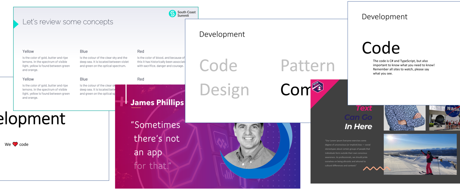
After being to South Coast Summit, at virtual Microsoft Ignite, Dataverse Summit and at my local work at CRMK, I have seen a lot of PowerPoints where I lost the content somewhere between you and me.
Focus is the most hard thing for me. Well before my stroke too.
🙂 I like PowerPoint, but
😍 I love to hear you talk!
There are a gazillions ideas out there already, but here are a few of my ideas.
I have always thought about these tips in general, before my stroke too. That’s what I liked in presentations. But today, these are not just “nice” – they are very much needed if you ever want me to get your message and what you have to say.
My tips are really very simple, and they also make it easier to create your presentation. Try it!
(More tips will mostly be added in the future.)
1. It is presentation, not documentation
If you ever screen your deck, don’t document it.
Writing a lot of text, then it is not a presentation! Sure, you may use PowerPoint to document (or anything) but when you want audience to listen to you, the PowerPoint cannot be more important than you are. If you write too much, is it since you don’t know or remember it to speak?
Who would ever both read and hear you?
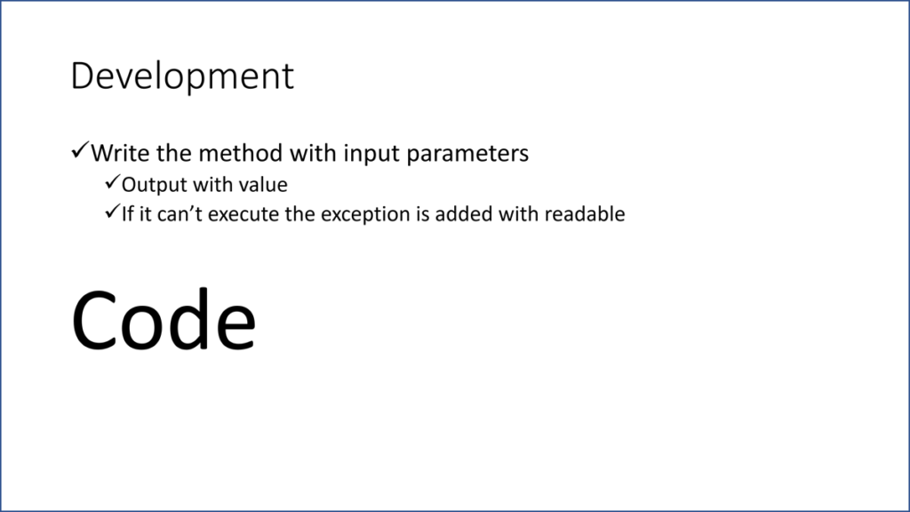
3. Bring one bullet
Don’t show your bullets before you talk about it.
5. No extra pictures
Don’t ever add any random pics. Period.
6. Nothing but bullets
Only only have bullets.
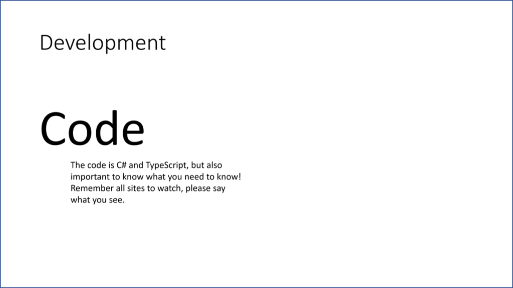
The bullets are there to show what you are talking about. That’s it. You may have three bullets for an hour, or three bullets for every minute. But don’t write “text” for you, and don’t ever ever read the text from the slides! Slides are on your side; they are not the center.
Don’t write your “text” – talk it!
7. You may have quotes
Okay for a few quotes.

If you add any quotes, the speaker shall read them out. You probably add one line in a time, to make it easier to reading. If you instead let the audience read it, then you need enough time to read it and they all need different time. For fast readers they will lose the listener, and if I am slow, I get stressed. So you read it out for us.
What a lovely quote!
8. Animations are ok
Remember: Animation and Transition takes time.
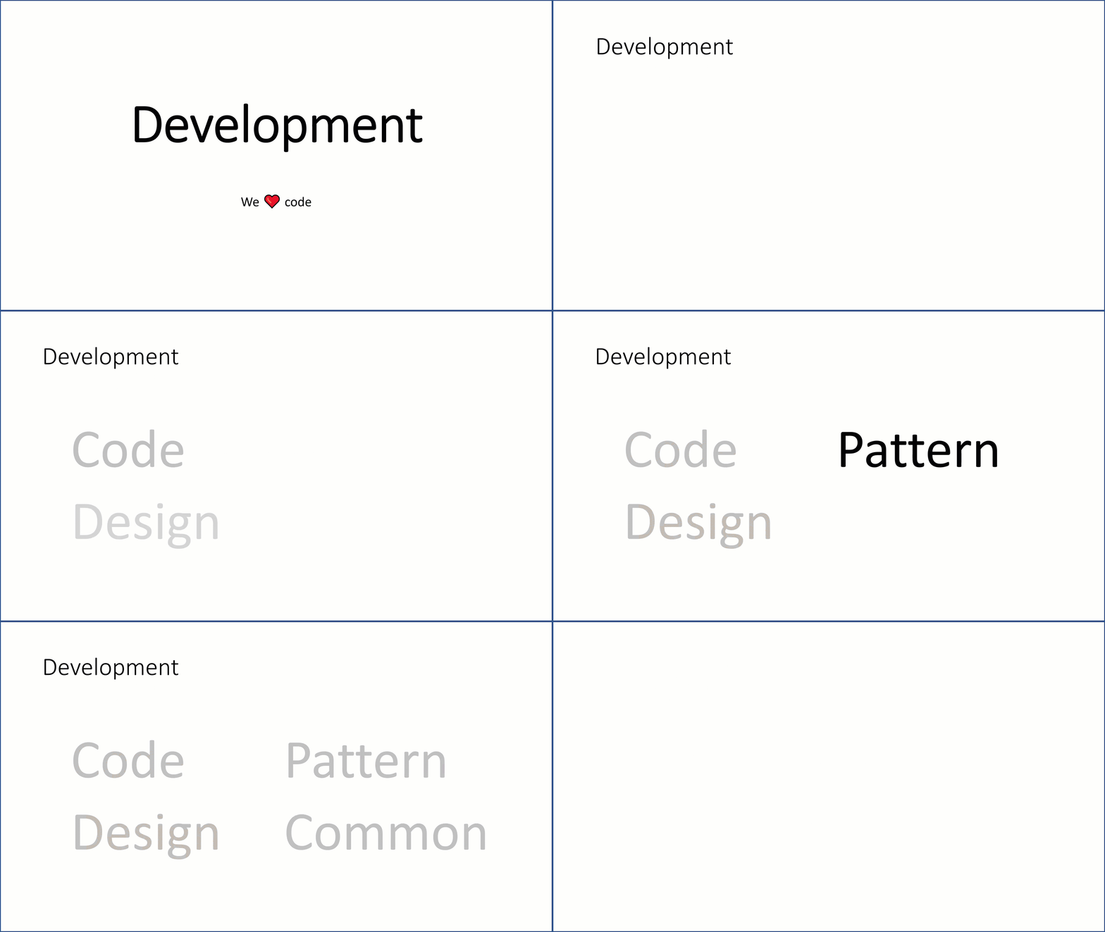
I like to use animation, mostly to only add new bullets a bit soft, instead the boom new bullet comes too fast. The same is the transition, to softy move on to next slide. Even more spacy animations can be used – but you make sure that each animation takes time, where you should never talk when it is moving. We only receive one thing at the time!
Perfect animation! Play to see it!
9. No crazy theme
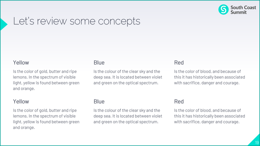
Use the minimum of crazy theme.

You are usually required to use a theme for PowerPoint. Sometimes these are really crazy, with all colors and added logo to every slide, some layouts with way too much “extras”. Find the simplest layout and stick with that for all slides. Or just don’t use the theme. Just do it.
Where do I read? Do I read? How much?
10. Eyes love dark
Dark is smoother, and lets you shine.
11. Subject smaller
The subject is not too important.
12. Why even have subject?
Do we need a subject at all?
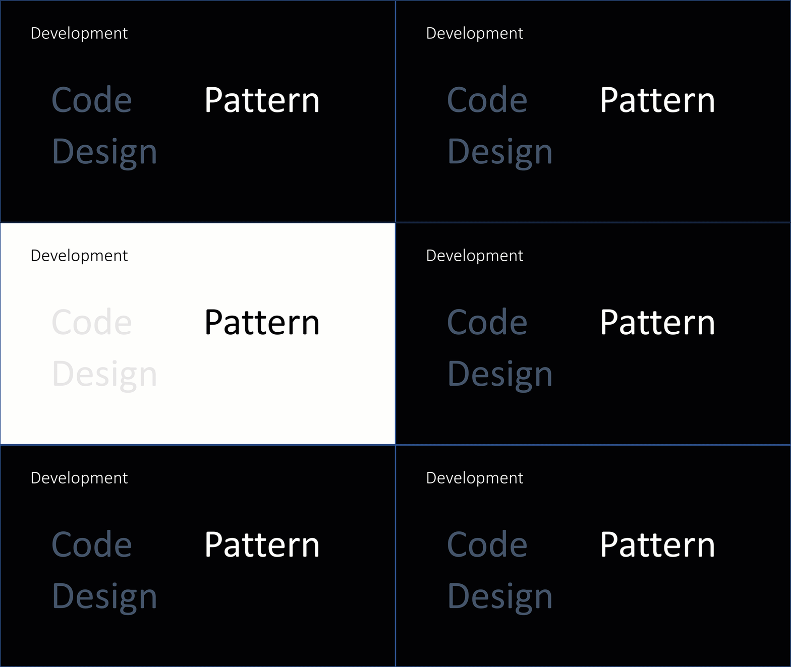
13. Use the space
We need to use space smart.
14. Kill the meta crap
The “meta” info adds nothing!
Your PowerPoint is too cool for you?
You want to talk?
You want us to listen to you?
Make sure you have more to say than show the PowerPoint.
Your PowerPoint is better than you?
That happens, you may be an awesome slide creator.
But then shut up, and send an email if we will never listen to you anyway.
It is okay!
Some people are great to be a speaker, other write great blogs.
But not all are great of both.
If you want to reach out, use your best channels that get the most.
Keep focus
But I know that you are probably a good speaker.
Keep the focus on you, not on the cool new pics and transitions and all “the text”.
PowerPoint is a great tool.
But YOU are in the center!
